Web Design & Development — 2026
Straußenhof Ott
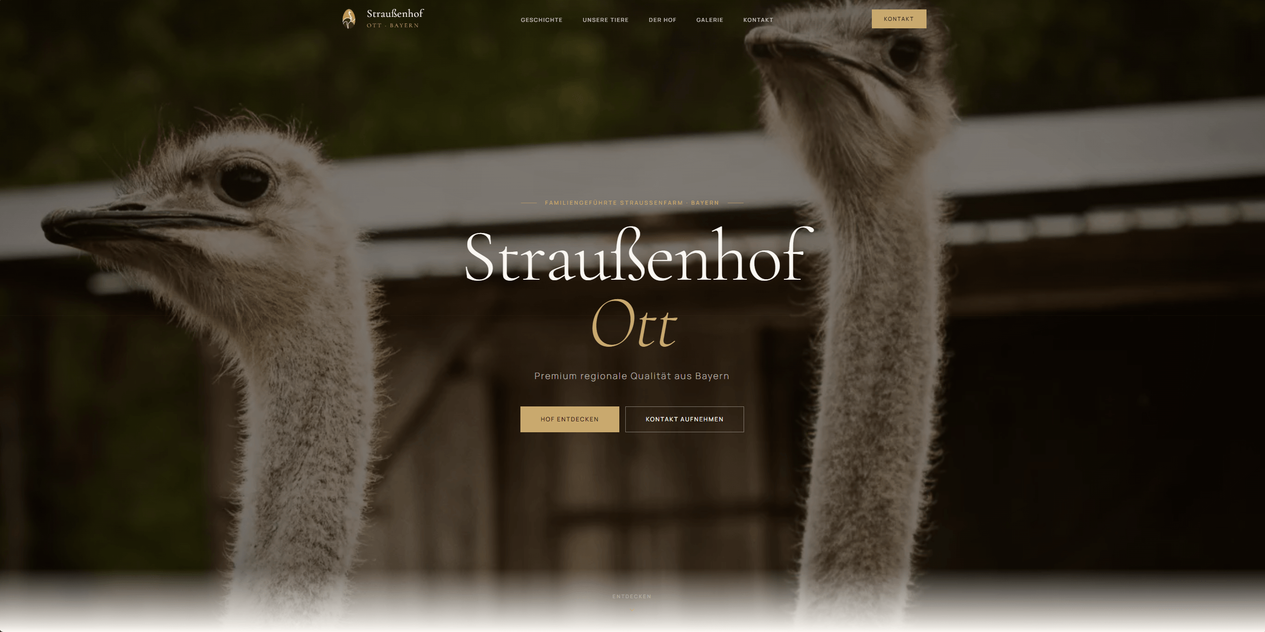
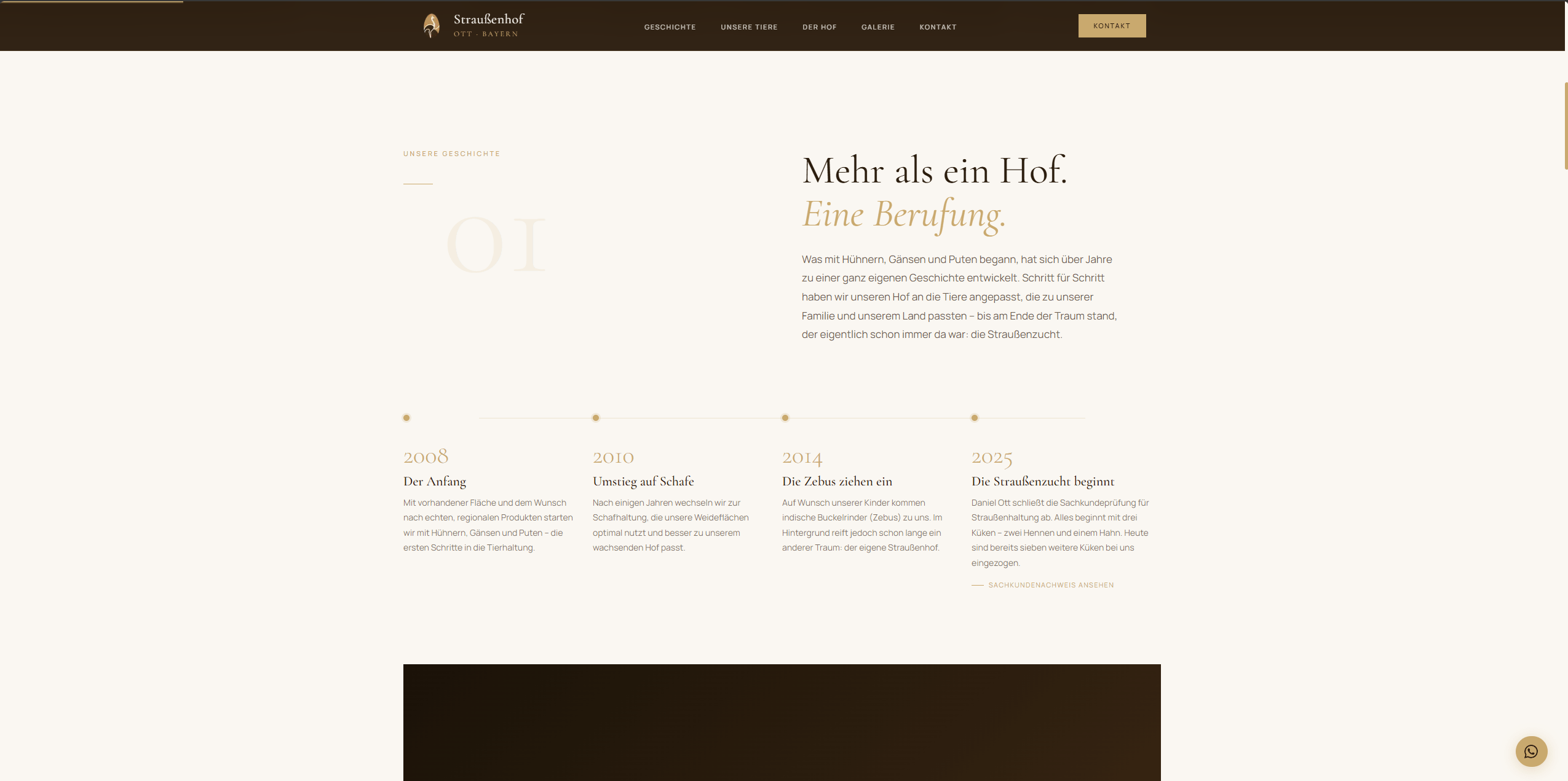
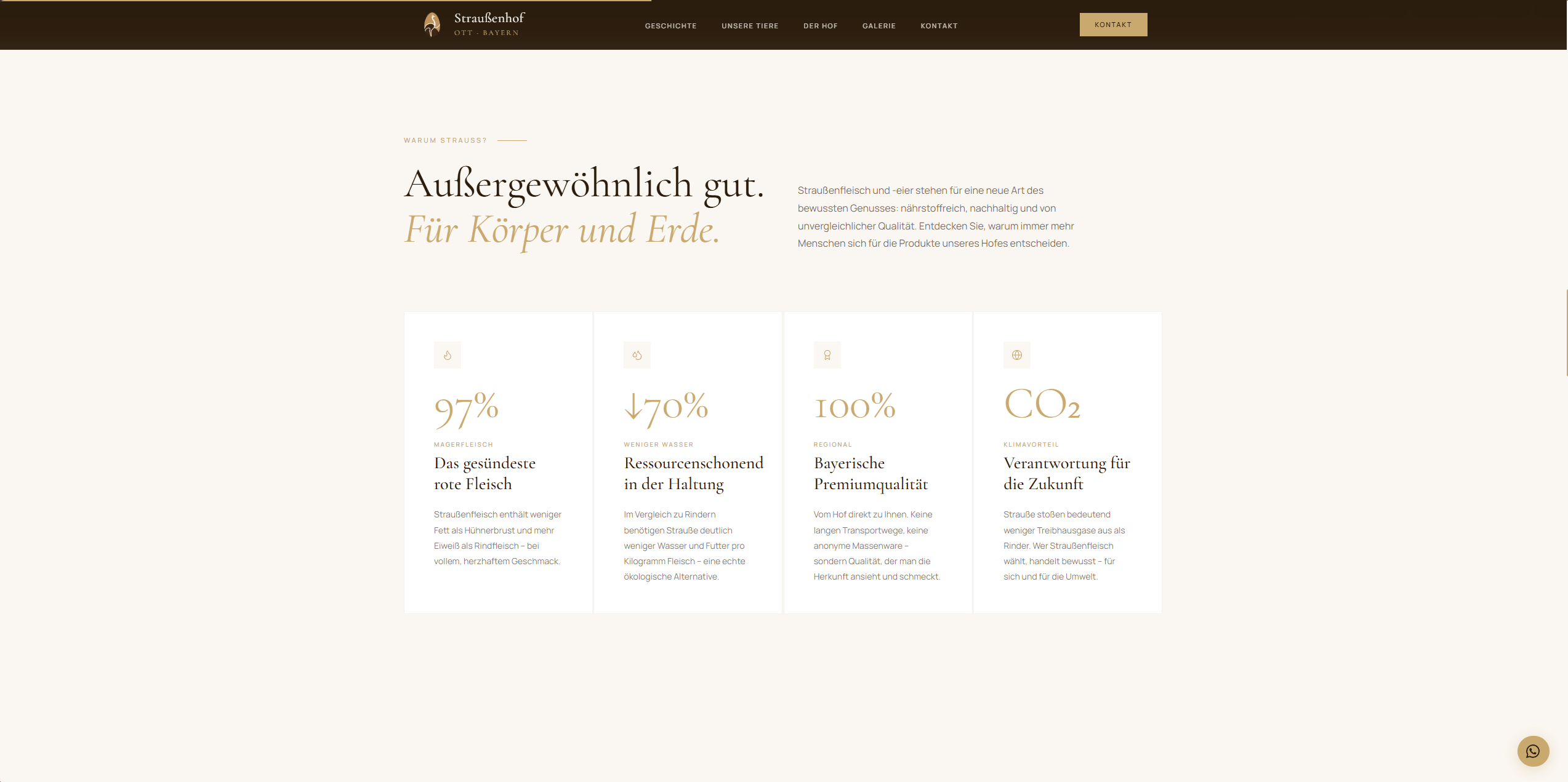
Full brand presence for Straußenhof Ott — editorial photography, bilingual website, logo system, and a custom booking flow, built from scratch.
The Brief
Mr. Ott came to us with a vision: open an ostrich farm where visitors could feed and experience the animals up close, and sell premium regional products — ostrich meat, eggs, and eventually liqueur — both online and in local shops. He had the land, he had the ostriches, and he had a clear sense of what he wanted it to feel like. What he didn't have was a logo, a brand, a website, or anything else. We started from zero.
The Challenge
The brief was clear from the first meeting: it had to feel premium. Not just for the farm visits, but because the products would eventually sit on shelves next to established regional brands. Every other farm website in Germany looks like a farm website — busy, rustic, outdated. Mr. Ott needed something that could hold its own next to premium food and lifestyle brands, and still feel warm and authentic.
Scope of Work
The Starting Point — Day 01
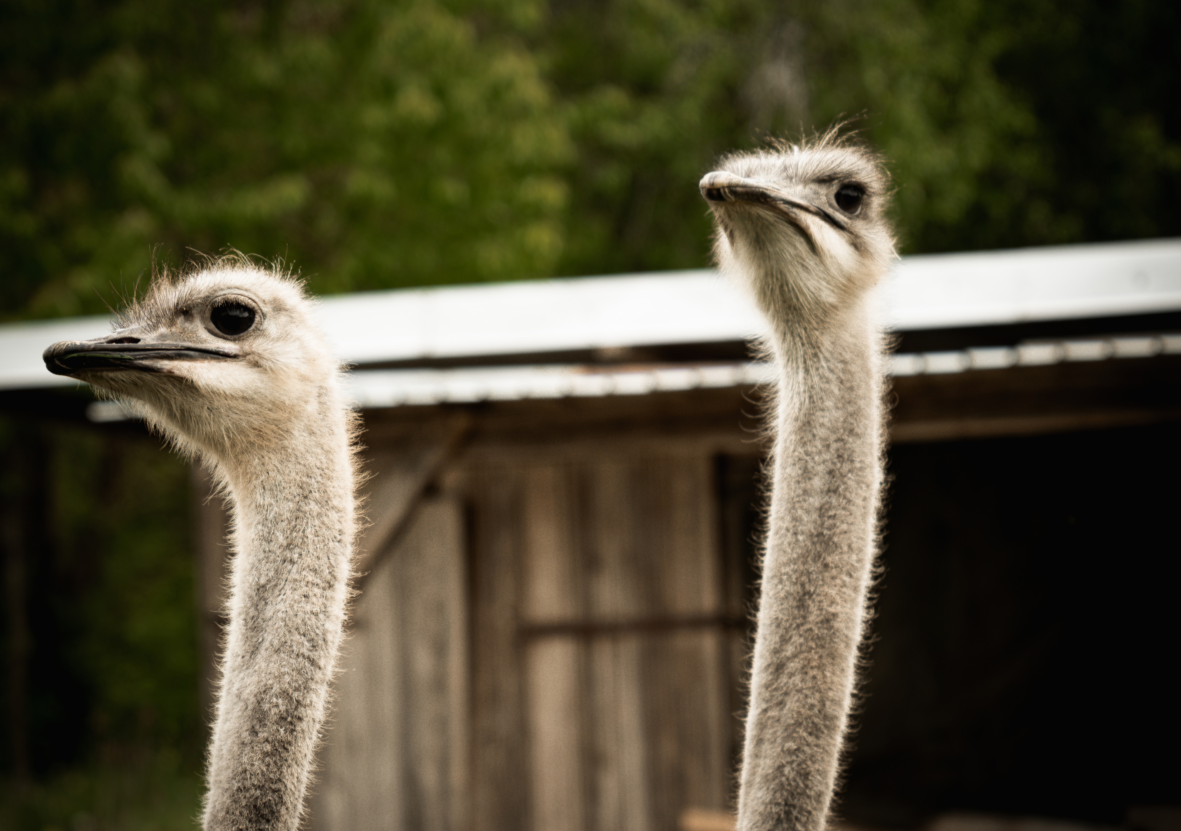
Started with nothing — no logo, no brand, no website. Just ostriches.
Identity System
Every element designed from scratch in under a week. Click each mark to explore the thinking.
01 / 07
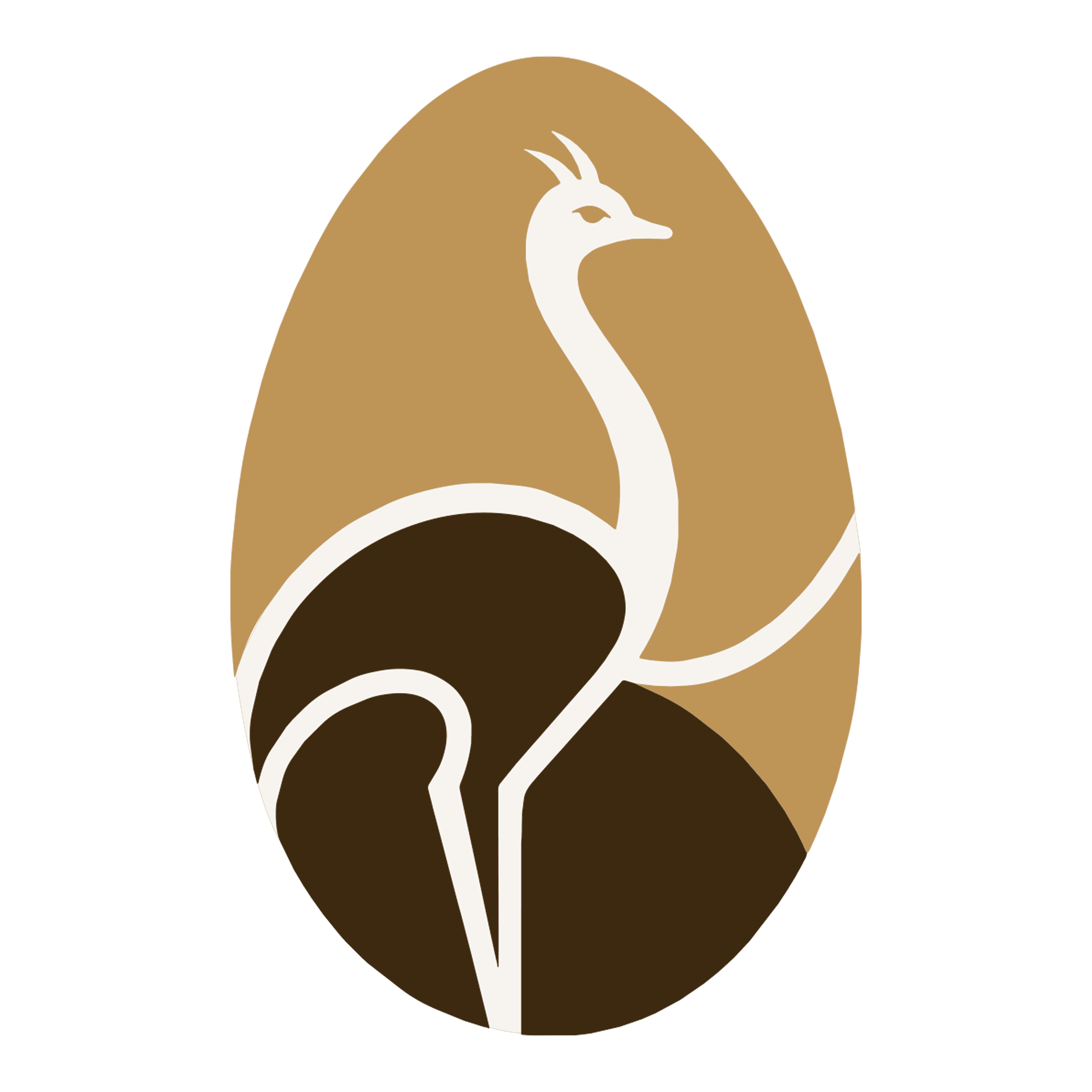
The Mark
An ostrich inside a golden egg — the entire identity in one emblem. His idea, our execution. Reads cleanly at any size, from a social media avatar to a wooden farm sign.
Color Palette
Deep Brown
#2B1D0E
The anchor. This brown carries the warmth of aged wood and dark soil — it grounds the entire brand and gives the gold somewhere to land.
Signature Gold
#C9A96E
The premium signal. Warm, never flashy. It reads craftsmanship on dark surfaces and pulls the brand out of the farm-shop category entirely.
Warm Cream
#FFFAF4
The breathing room. Warmer than white, softer than yellow — it lets the brown and gold do their job without competing for attention.
Dark Canvas
#1C1208
The depth behind the depth. Reserved for the most dramatic moments — headers, packaging, social media backgrounds where contrast has to hit hard.
Typography
01 — Primary Typeface
Cormorant Garamond
Aa Bb Cc Dd Ee Ff Gg Hh Ii Jj
ABCDEFGHIJKLMNOPQRSTUVWXYZ · 0123456789
SemiBold 600
Rooted in the Garamond tradition of the 16th century, refined for premium display. The high-contrast strokes and delicate serifs give Straußenhof Ott the editorial authority to stand next to luxury food brands — not farm shops. SemiBold gives it presence without surrendering the elegance.
02 — Secondary Typeface
Manrope
Aa Bb Cc Dd Ee Ff Gg Hh Ii Jj
ABCDEFGHIJKLMNOPQRSTUVWXYZ · 0123456789
Regular 400 · Medium 500
A refined geometric sans that holds the brand together wherever Cormorant Garamond would overpower. Used for body copy, UI labels, and all supporting text — Manrope brings clarity and calm. Regular handles running text, Medium steps in for navigation, CTAs, and anything that needs to be read fast.
Typografie-Hierarchie
Quality by conviction.
NATURAL. SUSTAINABLE. REGIONAL.
We raise our ostriches with care and respect. Our products stand for the highest quality, authentic taste, and responsible farming.
LEARN MORE →
What We Did
The Work
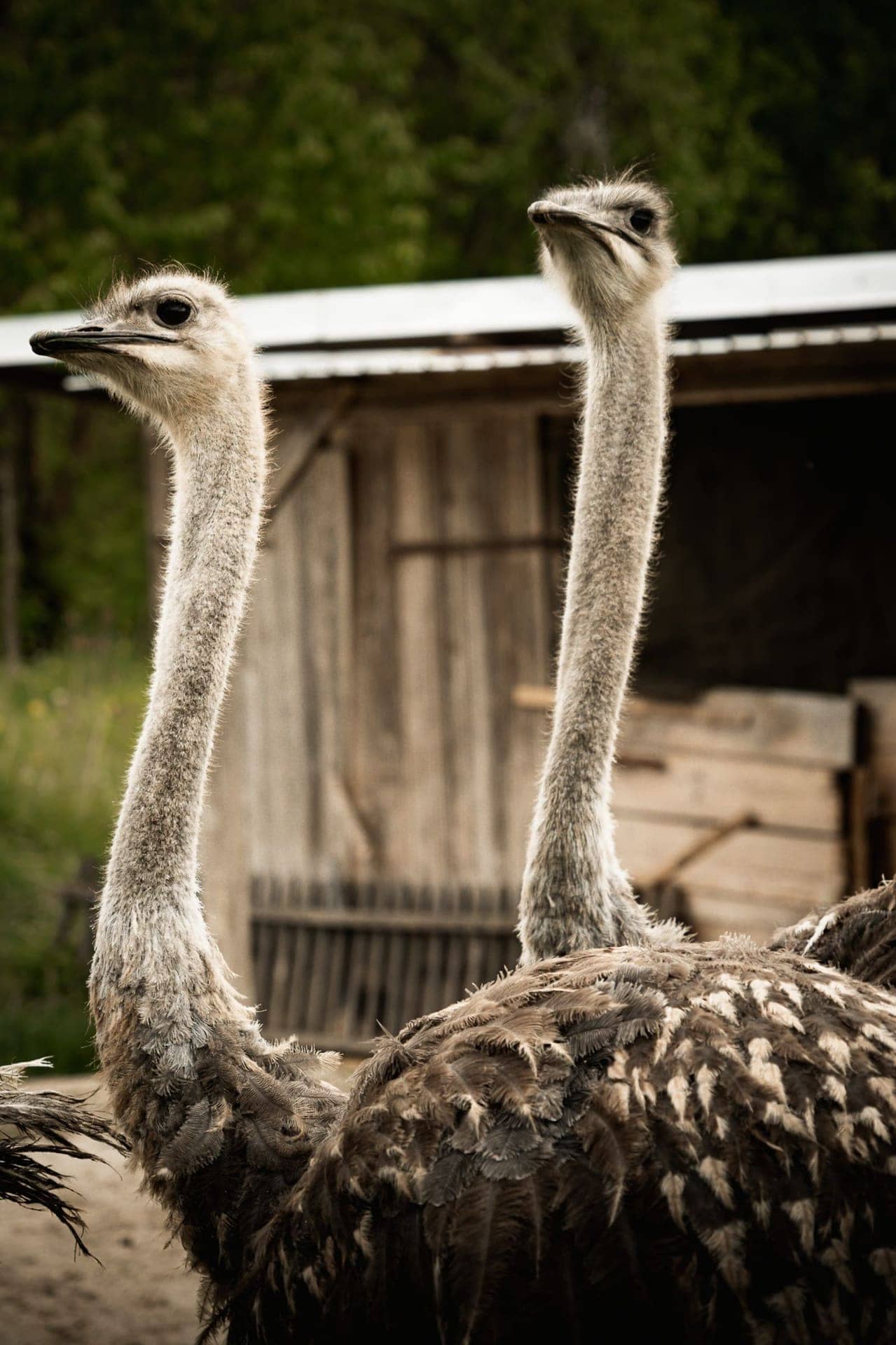
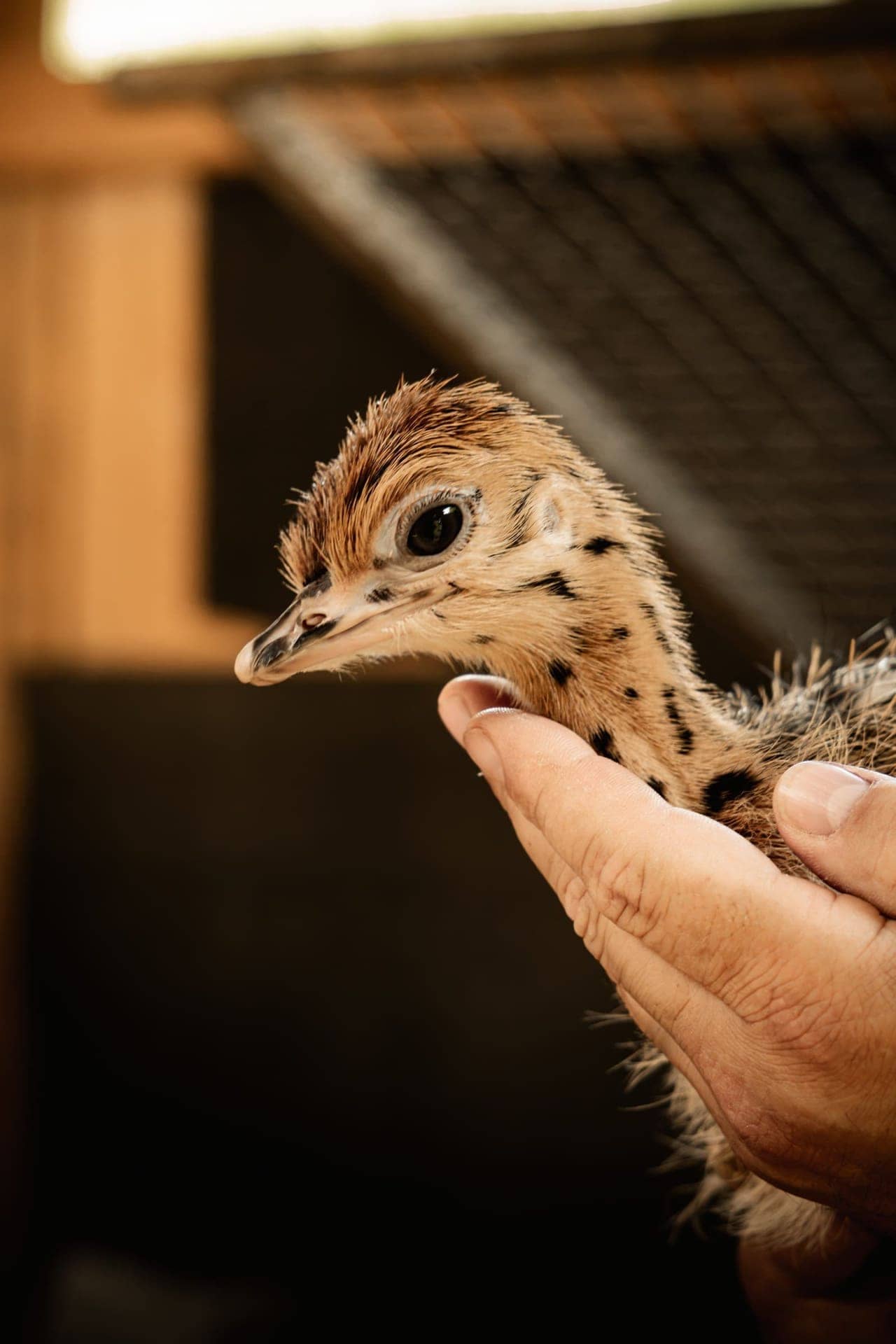
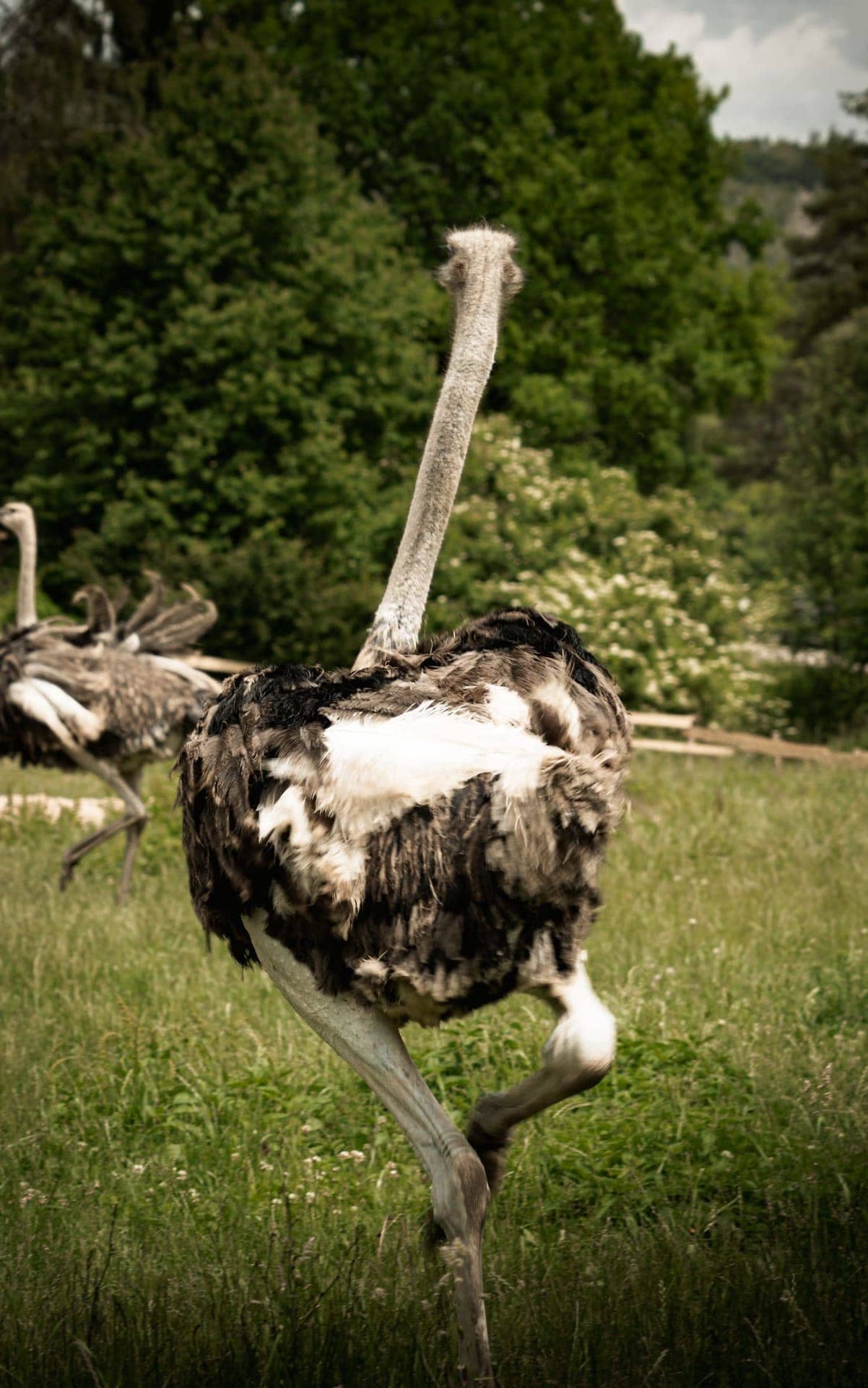
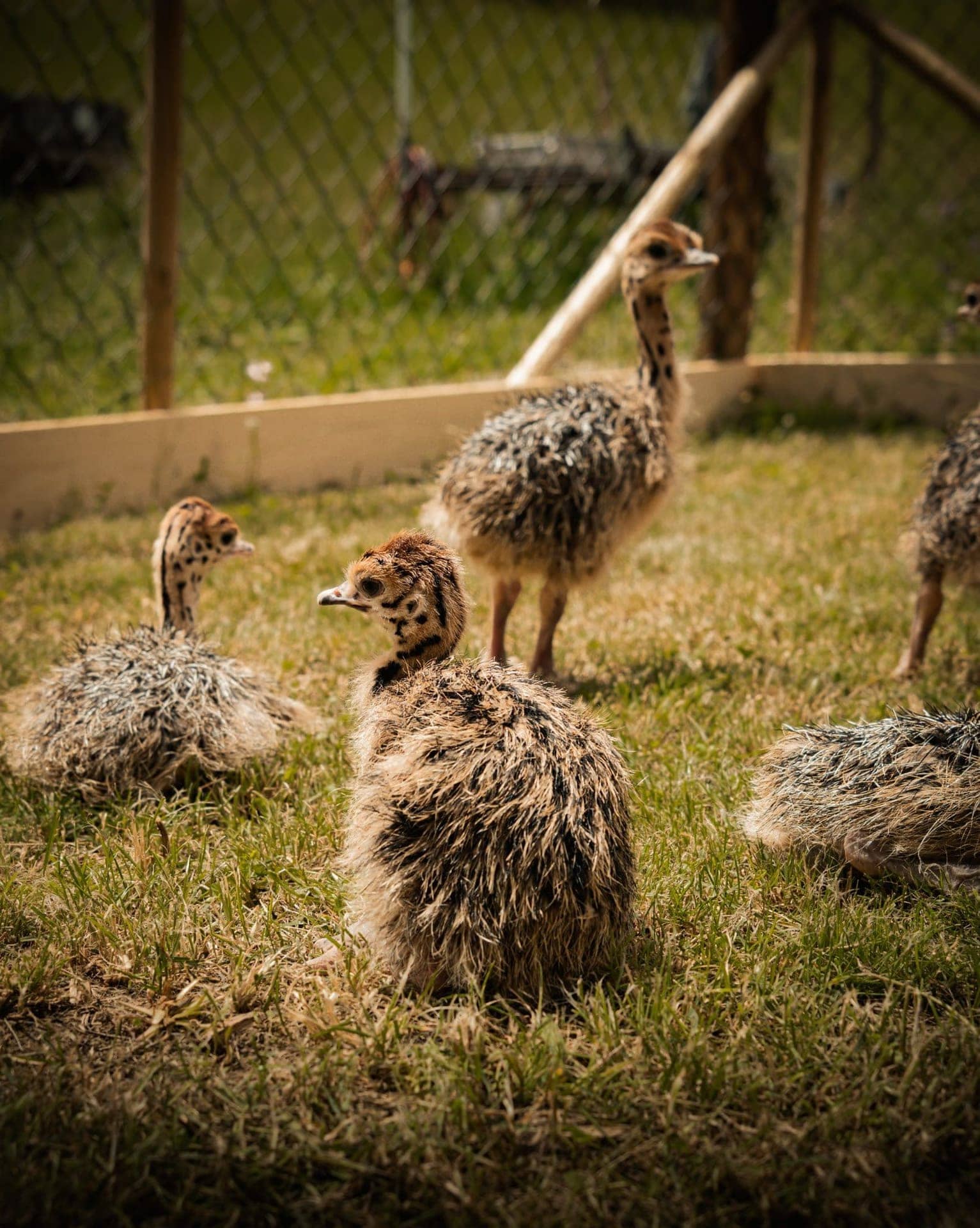
The Outcome
Site live at straussenhof-ott.de — full bilingual experience with integrated booking flow.
View Live Site