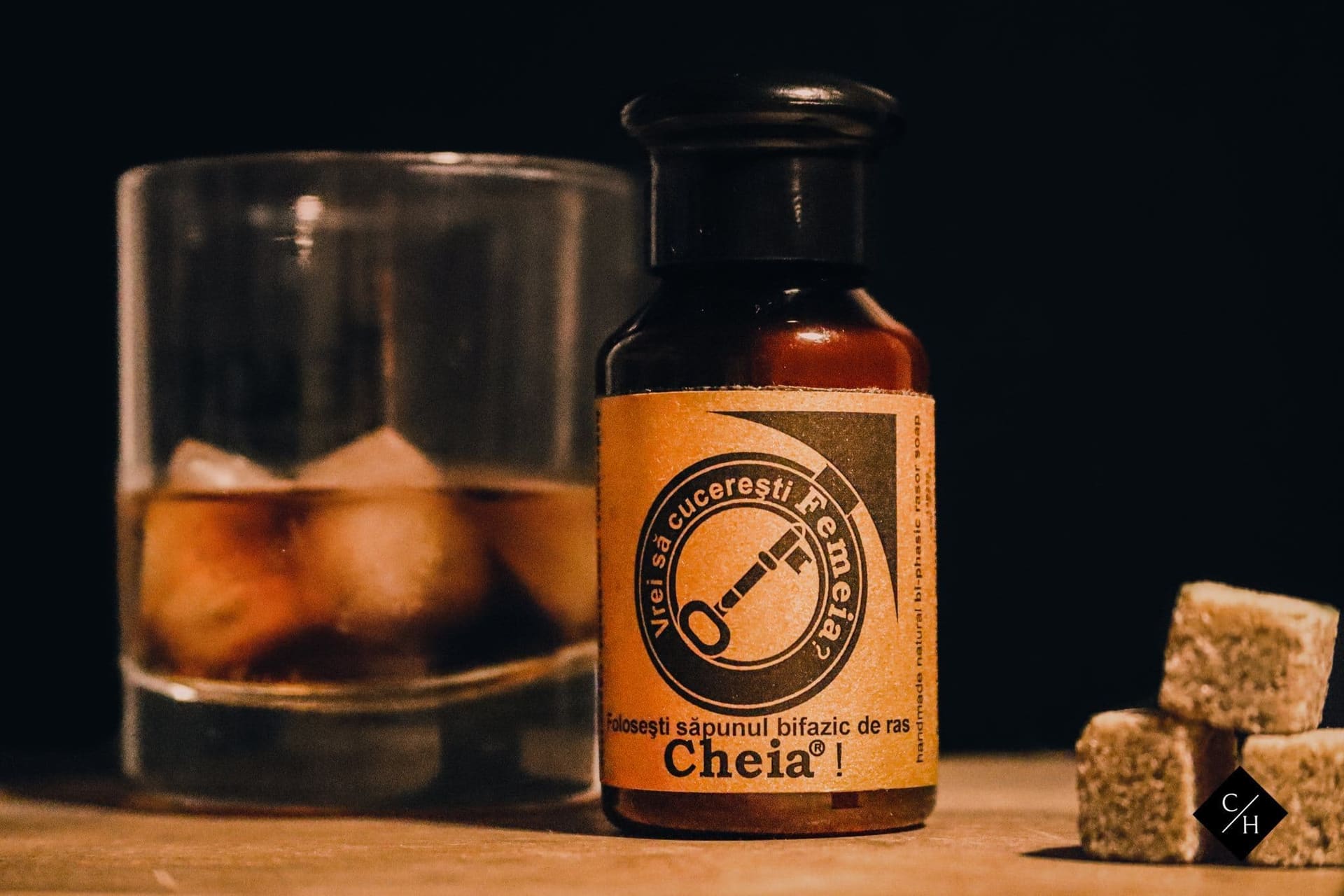
Brand Identity & Photography — 2022
Săpunul Cheia
Full rebrand for a Romanian soap maker founded in 1886 — identity, photography, social media, and a 30,000€ campaign on 650€ ad spend.
The Brief
Săpunul Cheia is a traditional soap maker from Baia Sprie, Maramureș, producing medicinal soaps since 1886. They came to us with real heritage and real products — but a visual identity that looked like a generic grocery label. They needed a complete creative partner: redesign the brand, shoot the products, grow their social presence, and run advertising that converted.
The Challenge
Medicinal soaps have a trust problem in the age of premium cosmetics. The formulas were genuinely good — unchanged for over a century — but the brand looked like it belonged on a pharmacy shelf from 1990. We wrote the brief ourselves and pitched it: make the brand feel as old and serious as it actually is, across packaging, photography, social media, and paid advertising. The name 'Cheia' means 'key' in Romanian. That became the concept anchor for everything.
Scope of Work
Identity System
Each mark carries the full weight of 140 years. Click to explore.
01 / 04
Black
The foundation. Every element earns its place — no decoration, no filler, just the mark in its purest form. This is the version you stamp when you want people to remember.
Label System
Black
The stamp. Clean, authoritative, works on any surface. No frills — just Cheia.
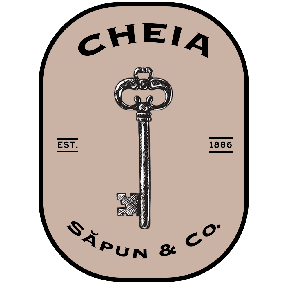
Rose
Taupe fill, bold border. The gentle and skincare line — approachable but never soft.
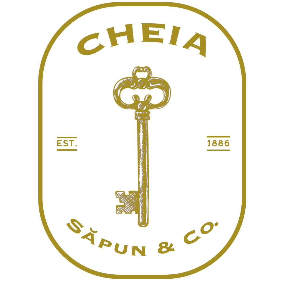
Gold
White and gold — the premium tier. Boutique-ready from day one.
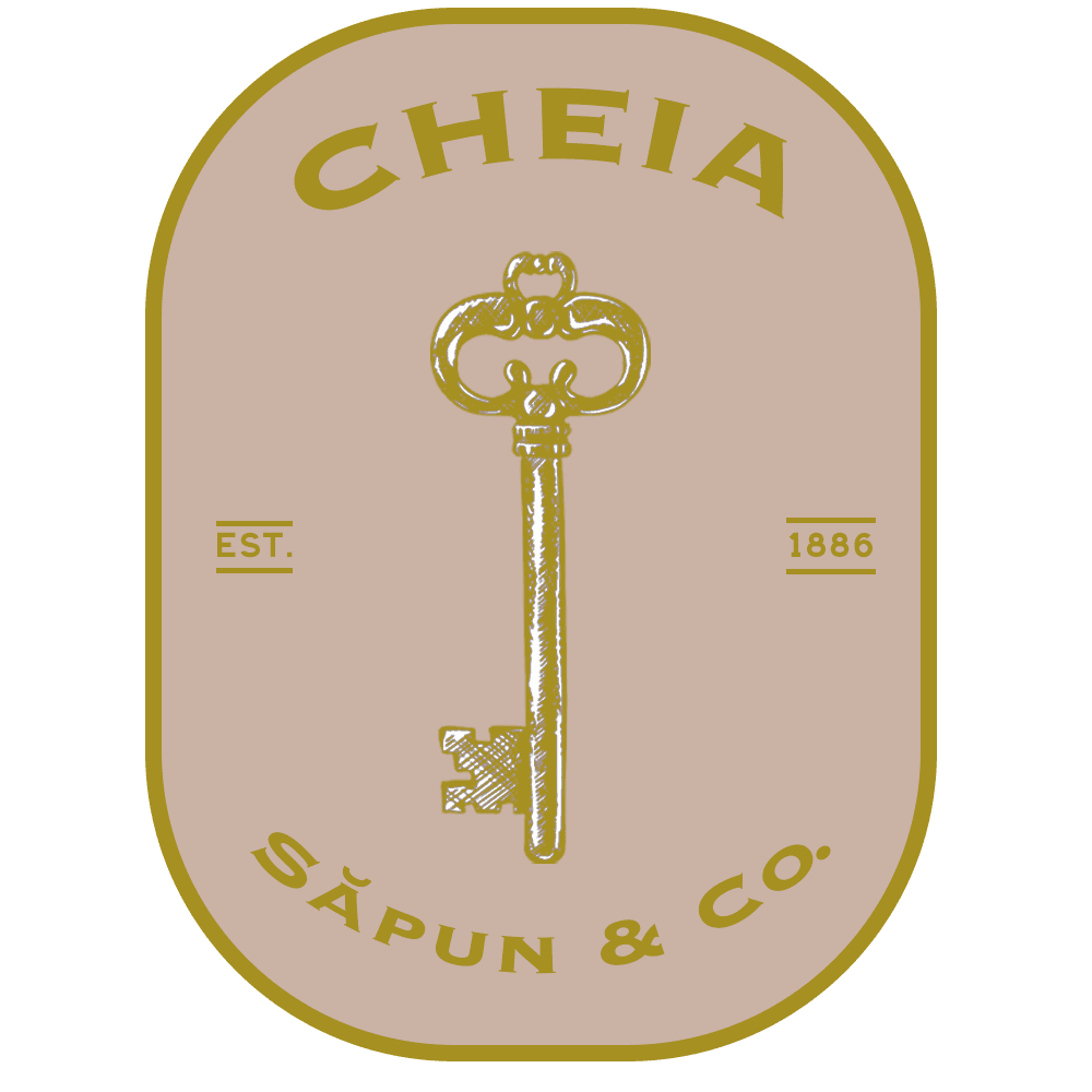
Gold & Rose
The warmest pairing in the system. Gold on taupe. Made for the artisan soap range.
The Identity We Inherited
Before — generic type, Romanian flag stripe, no identity system

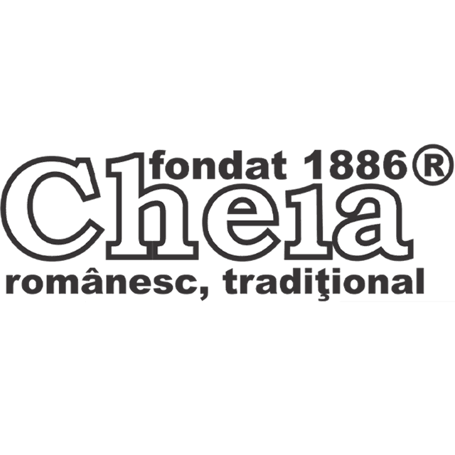
Wordmark
The original wordmark — 'Cheia, fondat 1886®, românesc, tradițional.' Heritage in the text, but no visual system to carry it.

Circle Mark
The stamp icon they've used since the beginning. Stamped on every product, unchanged. The client kept it.

Key — Olive
The skeleton key in the brand's original dark olive. Pre-dates any identity system — used inconsistently across packaging.
Key — White
White variant of the key icon. Existed but had no defined usage rules or colourway system behind it.
What We Did
The Work
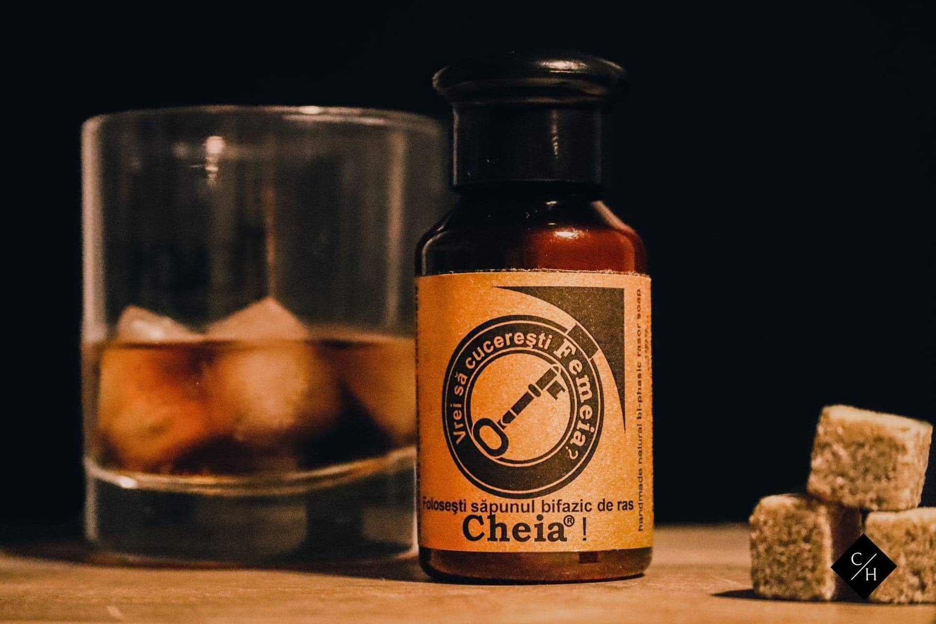
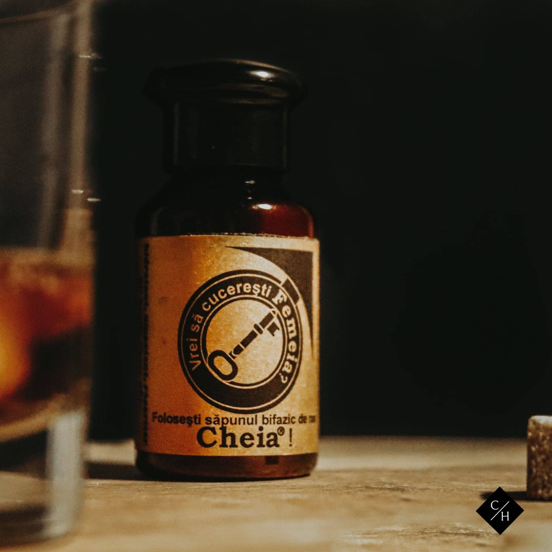
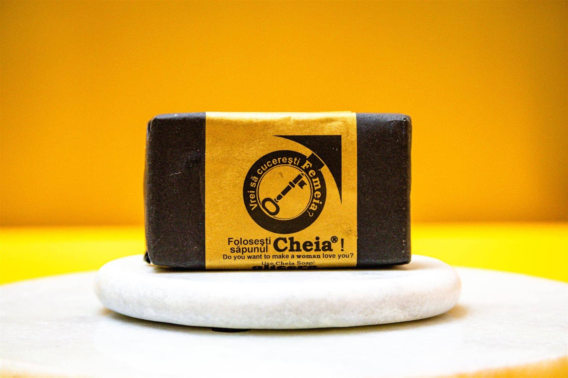
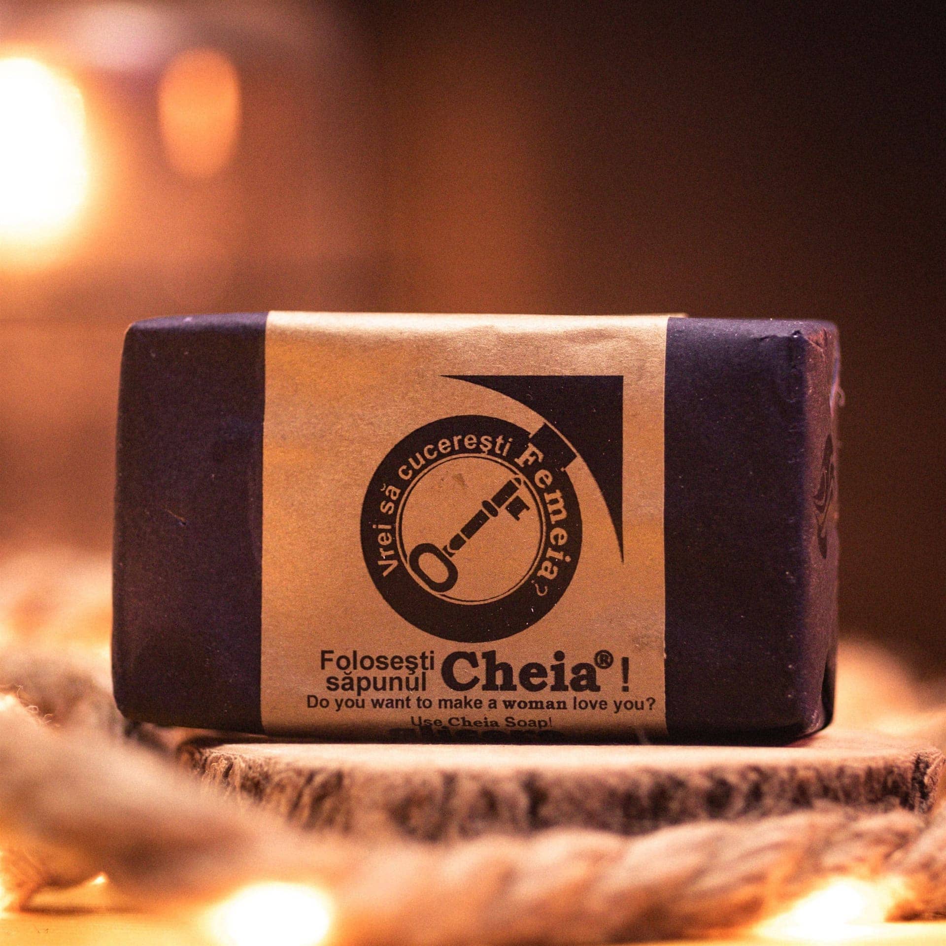
Campaign Executions
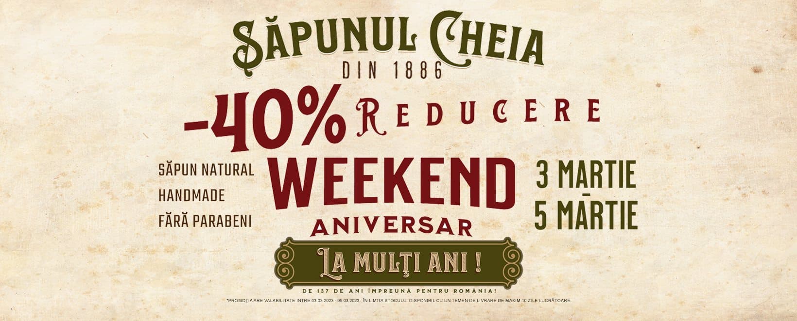
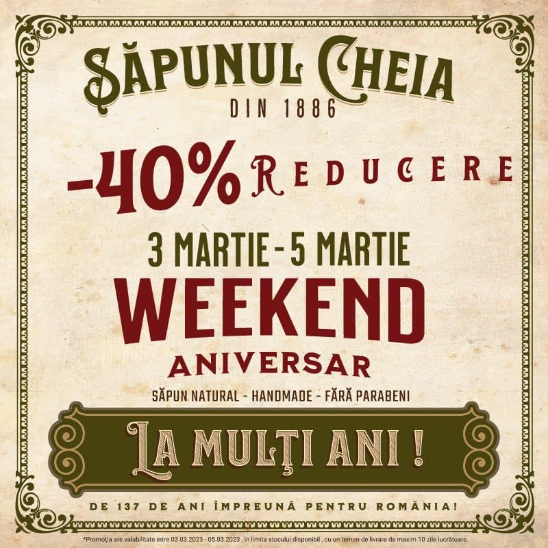
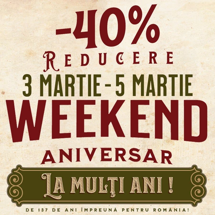
137th Anniversary Campaign
A 3-day birthday sale for Cheia's 137th year. Heritage typography applied across Facebook, email, and paid ads — fully designed and deployed in-house.
Copy That Ran
“-40% Reducere · Weekend Aniversar · 3–5 Martie. Săpun Natural · Handmade · Fără Parabeni. De 137 de ani împreună pentru România!”
1 December Campaign
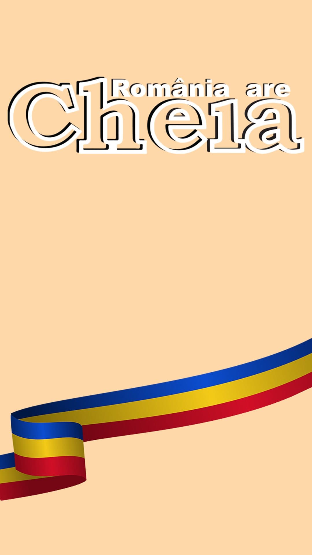
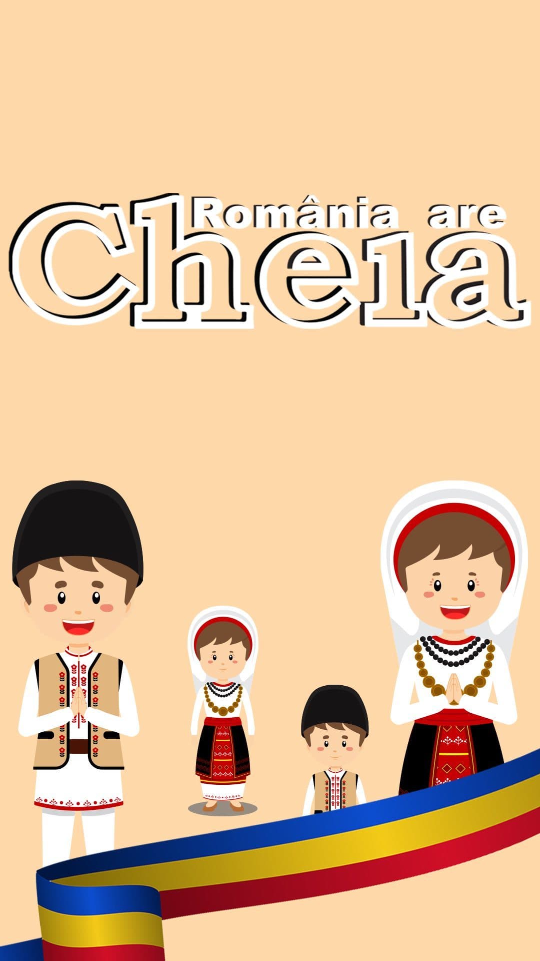
National Day sale executed entirely through Instagram Stories — one variant per product line, 10 stories produced.
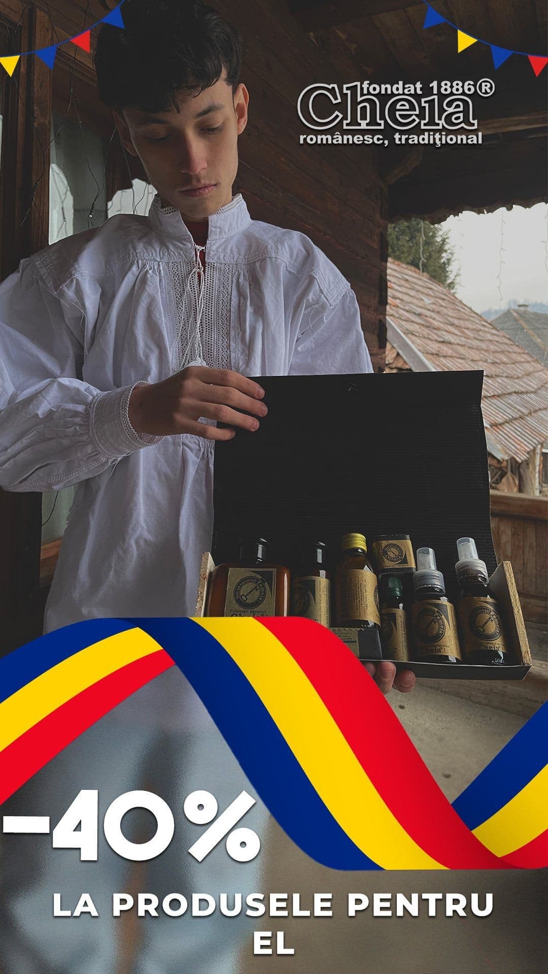
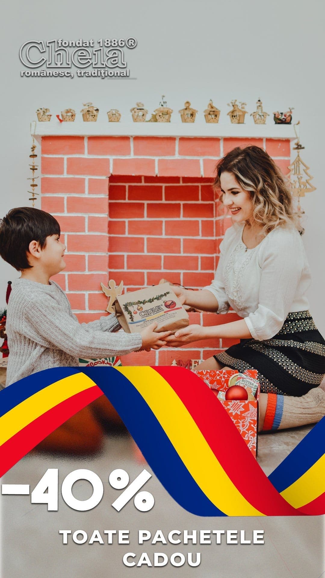
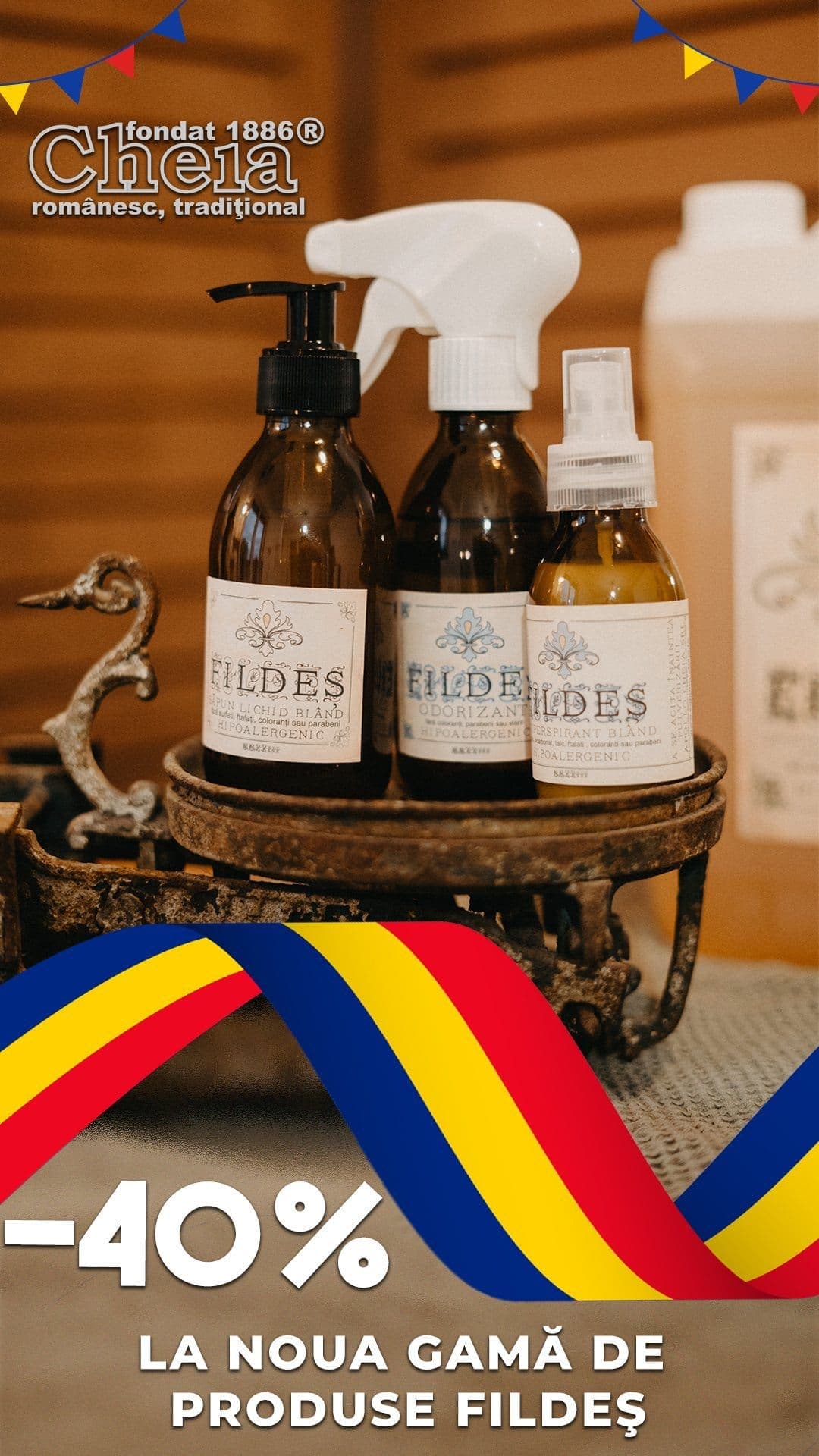
1 December Campaign — National Day
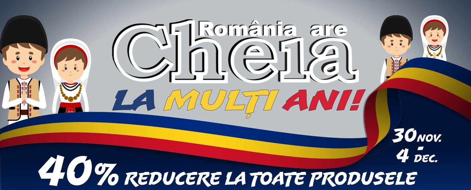
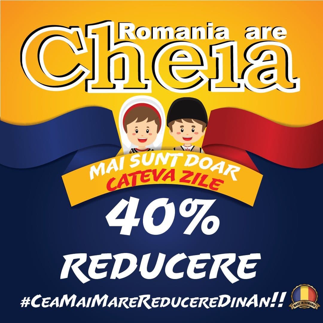
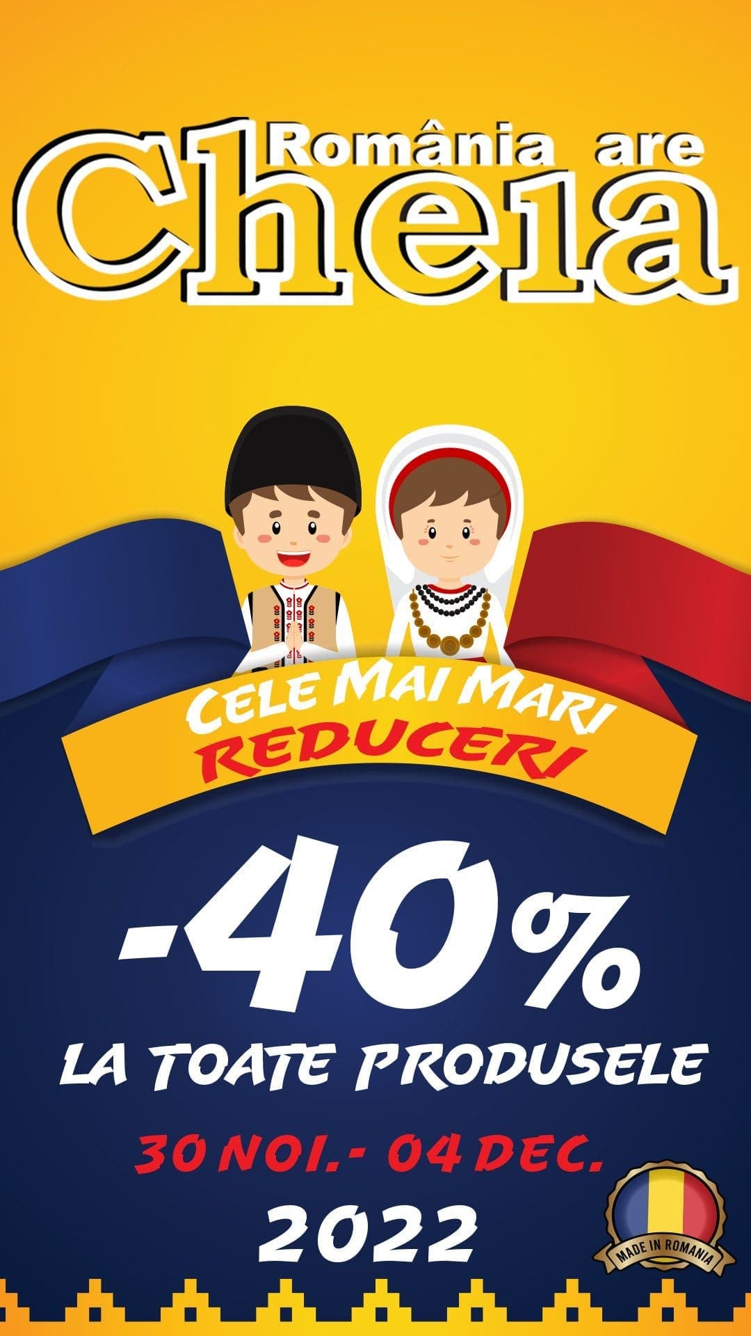
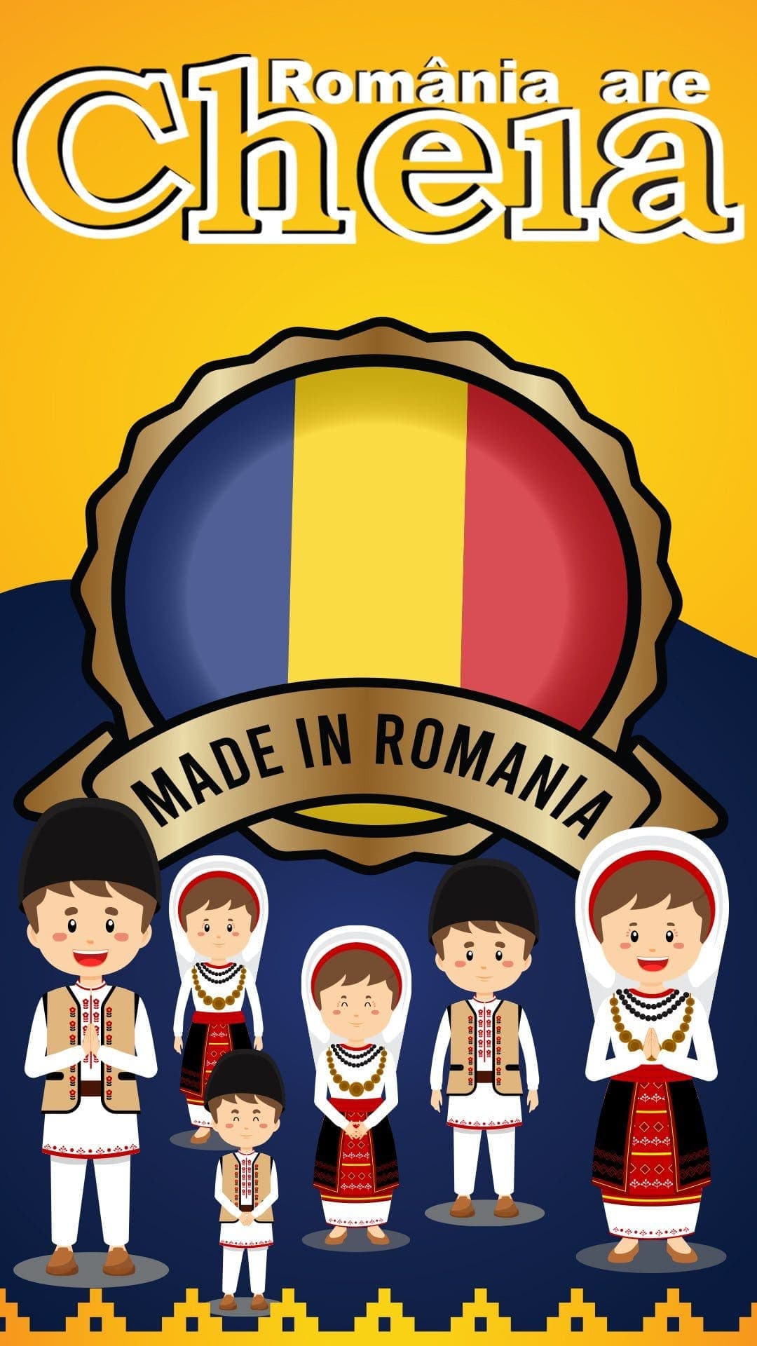
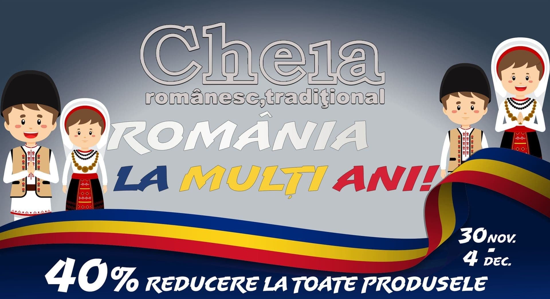
A 5-day sale timed to Romania's National Day. Every touchpoint designed and deployed in 72 hours — Facebook, paid ads, Instagram stories, posts, and the full website.
Copy That Ran
“Ești pregătit pentru cele mai mari reduceri din an? Săpunul Cheia sărbătorește ziua Națională a României cu o reducere de -40% la TOATE produsele! Tradiția noastră de peste 100 de ani: «Cheia, alături de români» continuă!”
“Nu te-ai hotărât încă dacă să plasezi comanda? Nu uita că doar până pe 4 Decembrie te poți bucura de reducerea de -40% la TOATE PRODUSELE Cheia!”

The Outcome
We 3×'d what their previous agency was doing — in 72 hours.
650€ across Meta, Google, and email. 30,000€ in revenue, three days. Instagram grew from 4,500 to 6,000, Facebook from 8,000 to 12,000 — 5,500 new followers across both platforms in the same campaign window.