
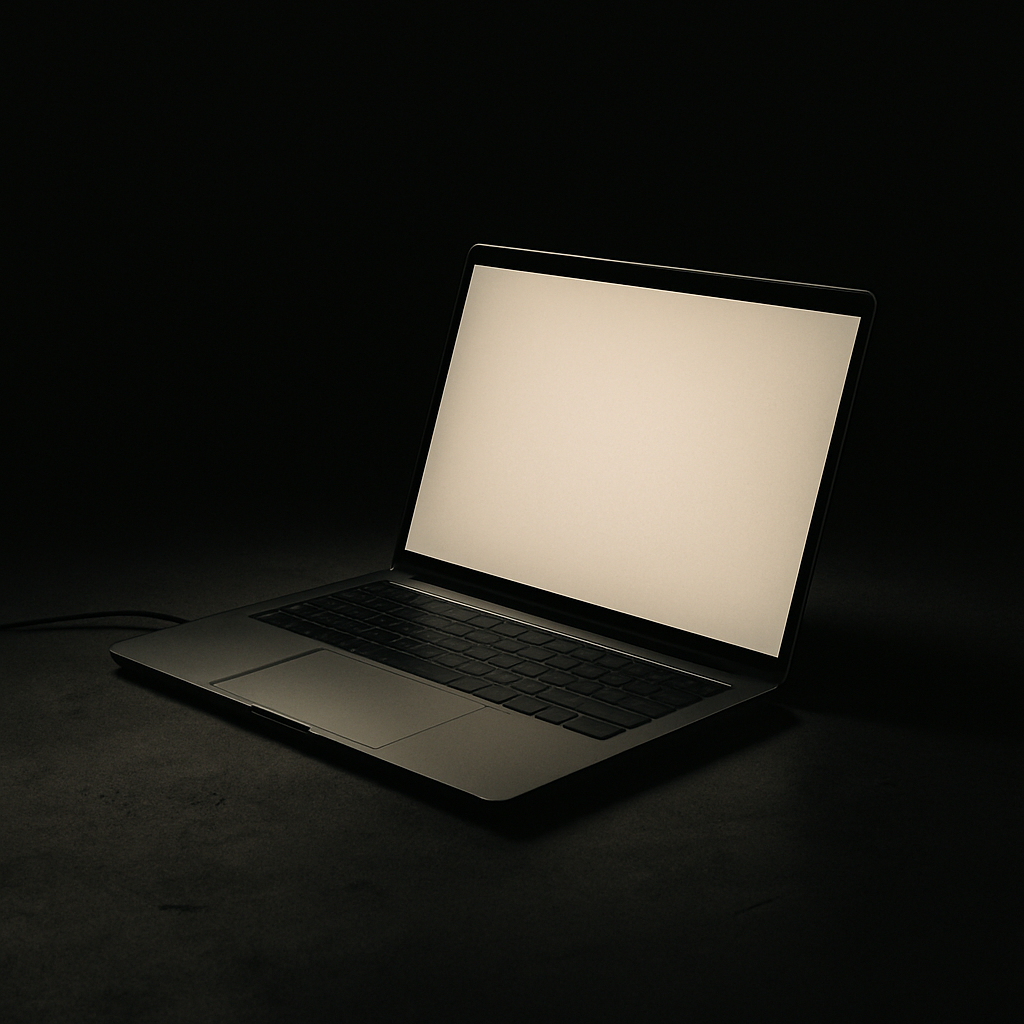
Most clients, at some point, look at a clean design and ask the same question: *Can we fill that space with something?* It's an understandable instinct. Space feels like absence. Like something unfinished. Like money left on the table.
White Space Is Doing More Work Than You Think
It isn't.
White space — also called negative space — is one of the most powerful tools in a designer's arsenal. It's not the absence of design. It is the design. And understanding why changes how you think about your entire brand presence.
What White Space Actually Does
At its core, white space gives elements room to breathe. But that's a simplistic way to describe something with real functional consequences.
When visual elements are crowded together, the human brain works harder to process them. Cognitive load increases. Attention scatters. Users either skim past everything or leave entirely. White space reduces cognitive load by creating clear visual hierarchies — telling the eye where to go, what matters most, and in what order to consume information.
Studies in typography have shown that generous line spacing — a form of micro white space — can improve reading comprehension by up to 20%. That's not aesthetic preference. That's measurable impact on how well your message lands.
The Difference Between Cheap and Premium
Think about the brands you associate with luxury. Apple. Aesop. Loro Piana. Now think about their visual communication. What do they have in common?
Space. Lots of it.
This isn't coincidence. White space signals confidence. It says: we don't need to shout. Our product speaks for itself. Cluttered design, by contrast, creates visual anxiety — the digital equivalent of a market stall vendor listing every possible benefit at full volume.
When a brand crowds its website or marketing materials with competing elements, it inadvertently communicates uncertainty. As if it doesn't trust any single message to carry the weight alone. Premium positioning requires restraint, and restraint requires space.
White Space and Conversion
Here's where the business case becomes undeniable. White space isn't just about looking good — it directly influences user behavior.
Clear calls-to-action surrounded by negative space consistently outperform those buried in cluttered layouts. When there's nothing competing for attention around a button or headline, users are more likely to focus on it, process it, and act on it.
The same logic applies to landing pages, product pages, and contact forms. Every time you add an element "just in case," you dilute the elements that actually matter. Simplicity isn't minimalism for its own sake — it's strategic prioritization.
The Hardest Part Is Saying No
The real challenge with white space isn't technical. It's psychological.
Clients often equate a full page with a thorough page. More information feels like more value. But users don't experience it that way. They experience it as noise. And in a world where attention is the scarcest resource a brand has, noise is the enemy.
Good design is an act of editing. It's deciding what not to include as much as what to put in. Every element you remove that isn't earning its place makes the elements that remain more powerful.
This requires trust — trust between a client and their design partner, and trust in the audience to connect the dots without being led by the hand through every single message.
Space Is a Decision, Not a Default
White space is never accidental in good design. It's deliberate. It's structured. It's the result of someone asking: does this element deserve to exist here? Does it serve the user? Does it serve the message?
When the answer is no, the space that remains isn't emptiness. It's clarity.
And clarity, in branding and web design, is worth more than any banner, badge, or bullet point you could put in its place.
At No More Dots, we design with intention — which means we're not afraid of space. We help brands communicate with precision and confidence, building digital presences that feel as considered as the businesses behind them. If you're ready to stop filling space and start using it strategically, let's talk.